app_design
ST pay - Digital Wallet
Project Overview
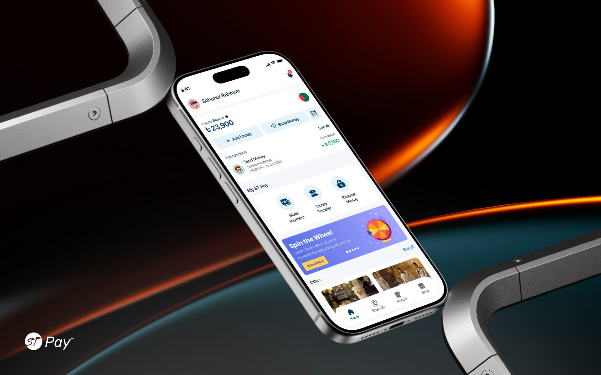
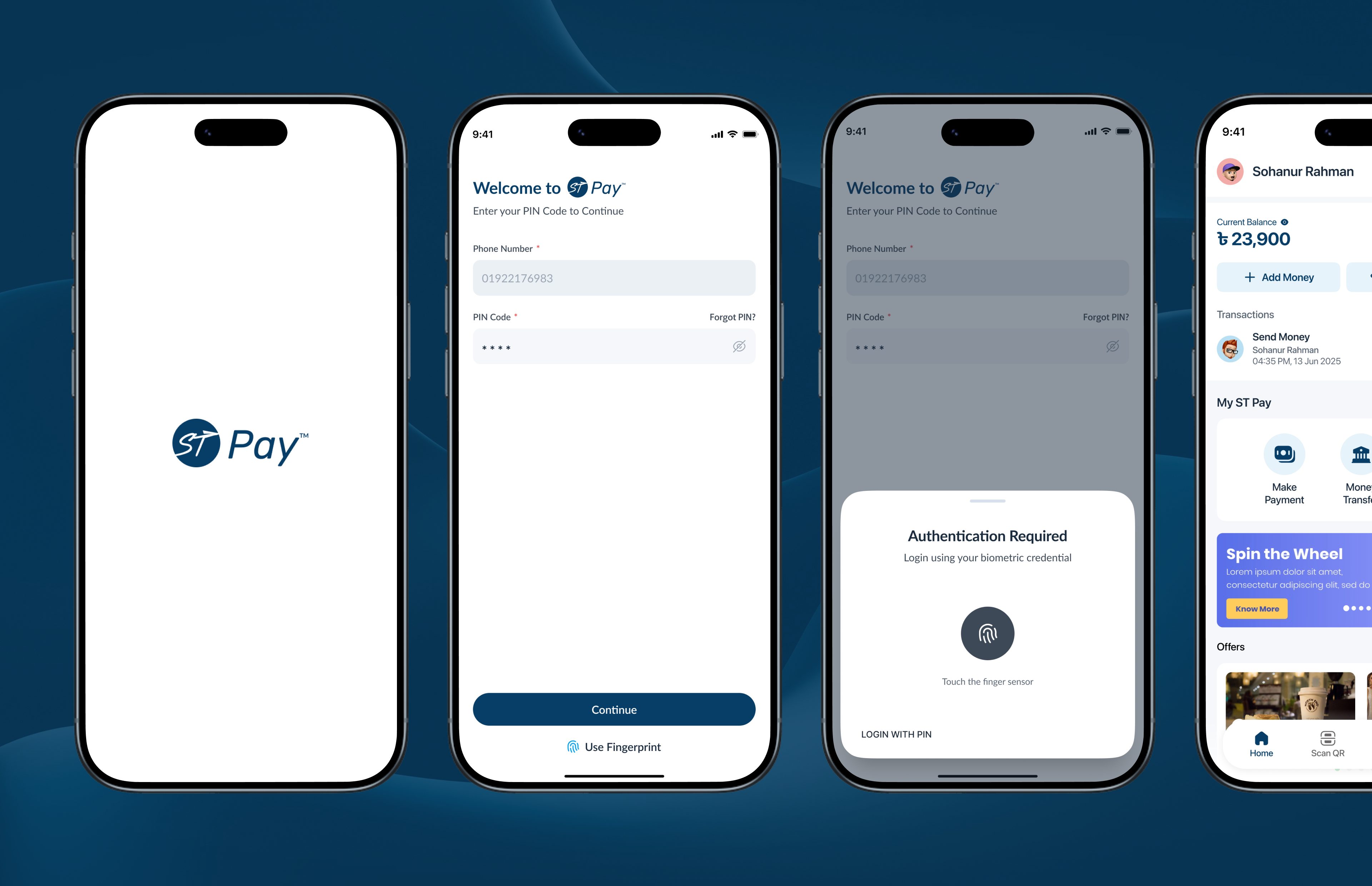
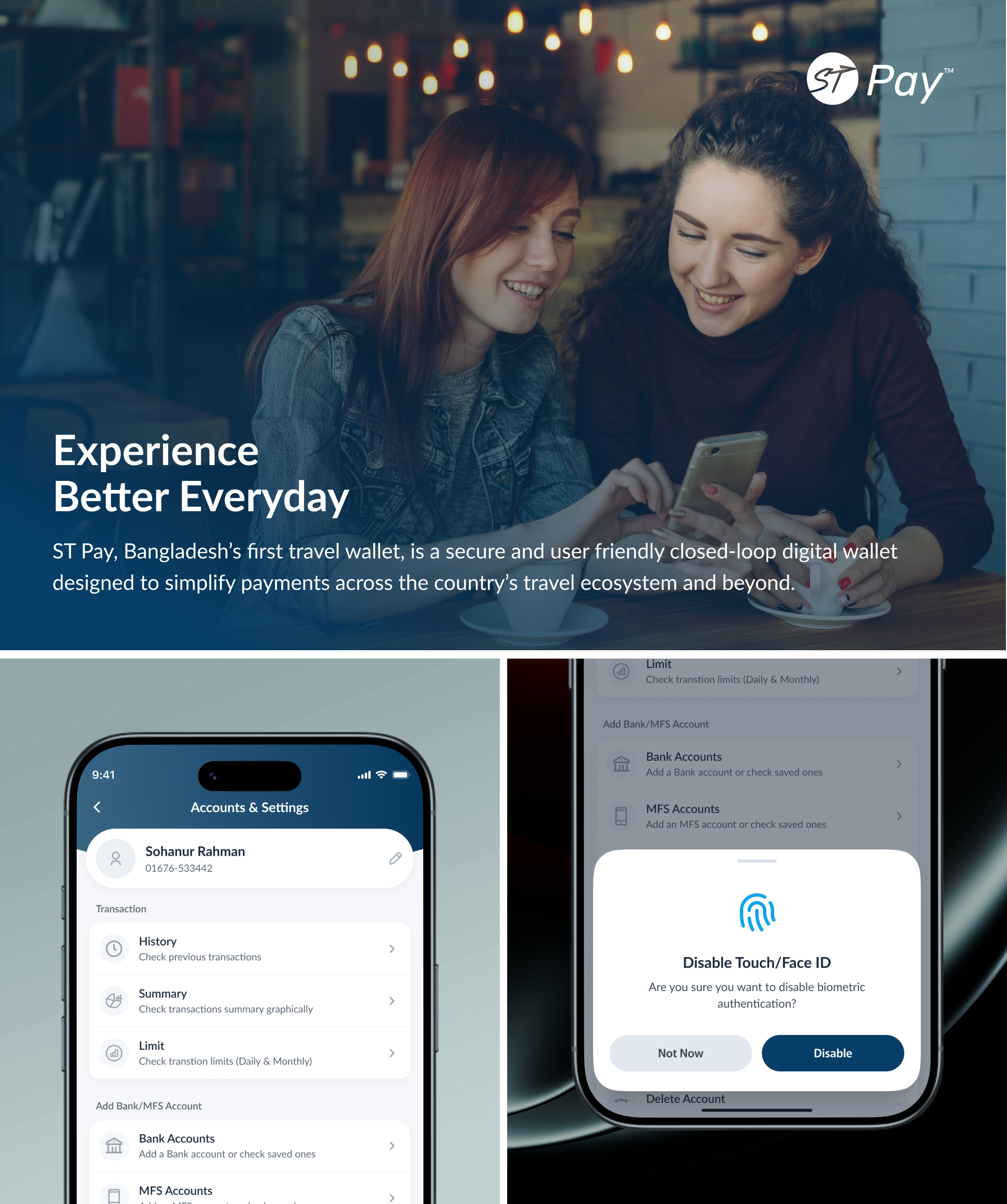
ST Pay is a secure in-app travel wallet designed to simplify payments for flights, hotels, and other travel services. The project focused on seamless top-ups, clear transaction history, and frictionless checkout — improving trust, activation, and transaction completion for travelers.
Industry
Fintech
Location
Bangladesh
Website
www.example.com
Problem Identification
Challenges in Everyday Payment Tasks
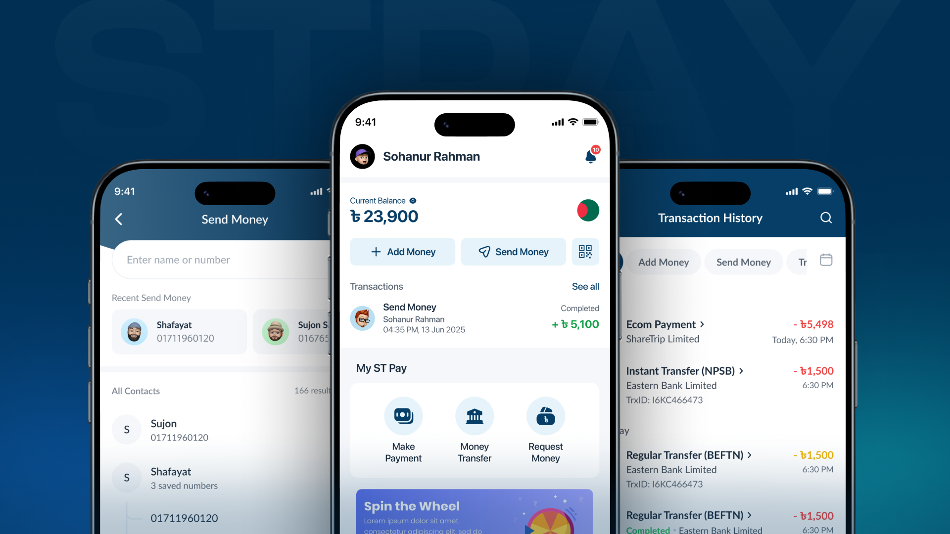
Users struggled to complete basic wallet actions due to poor interface structure, unclear guidance, and weak validation — leading to confusion, errors, and abandoned transactions.
- Cluttered interface: Poor spacing and weak visual hierarchy made it hard to scan and focus.
- Unclear guidance: Lack of instructions, especially for top-ups, created uncertainty.
- Weak input validation: Users could enter incorrect payment details without immediate feedback.
- Too many actions: Redundant call-to-actions added noise and slowed down decision-making.
- Confusing payment options: Fees and exchange rates were not clearly explained, causing hesitation and mistakes.
Solutions
Design Improvements
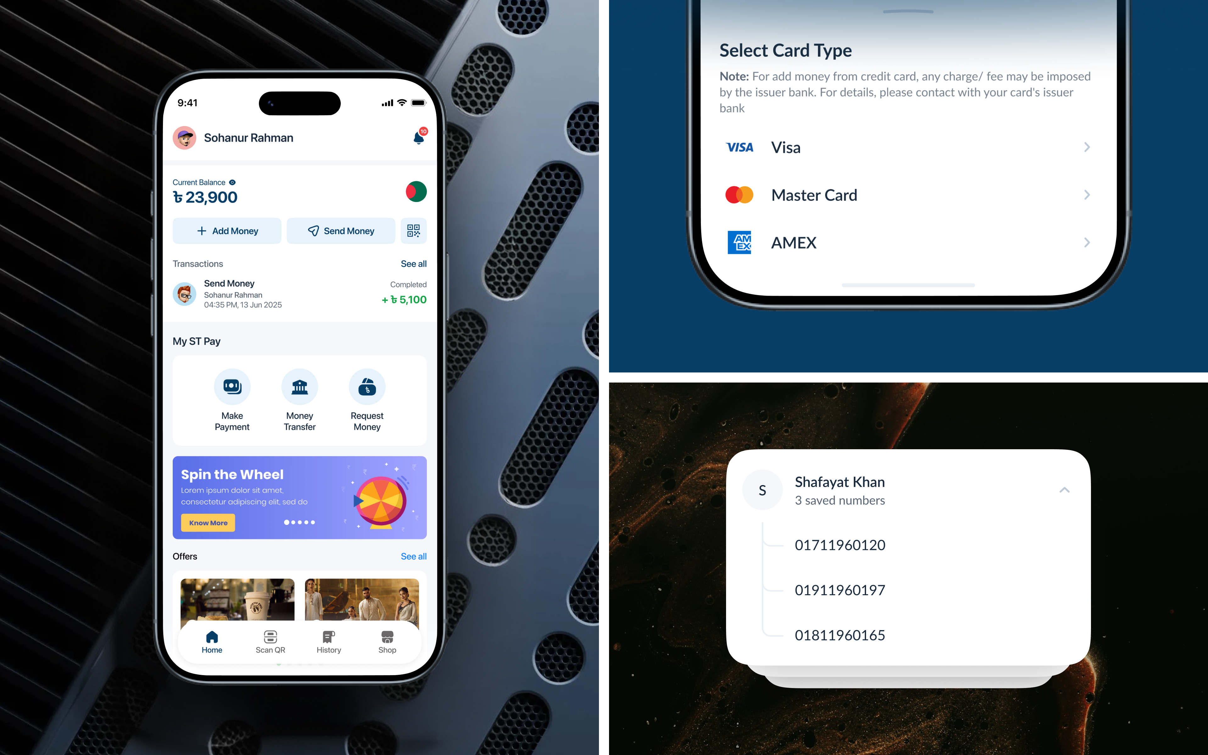
We redesigned the experience to reduce complexity, improve clarity, and guide users through payment tasks with confidence.
- Simplified interface: Cleaner layout with improved spacing and visual hierarchy for better focus.
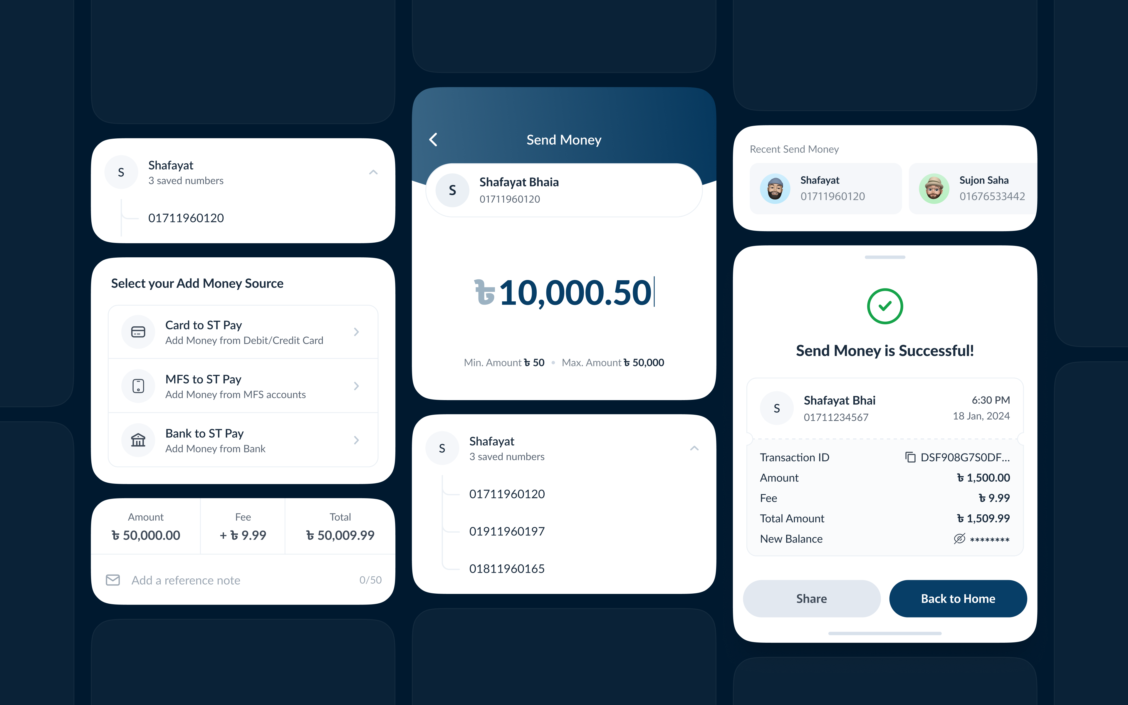
- Clearer guidance: Separated payment options and added helpful tooltips for better understanding.
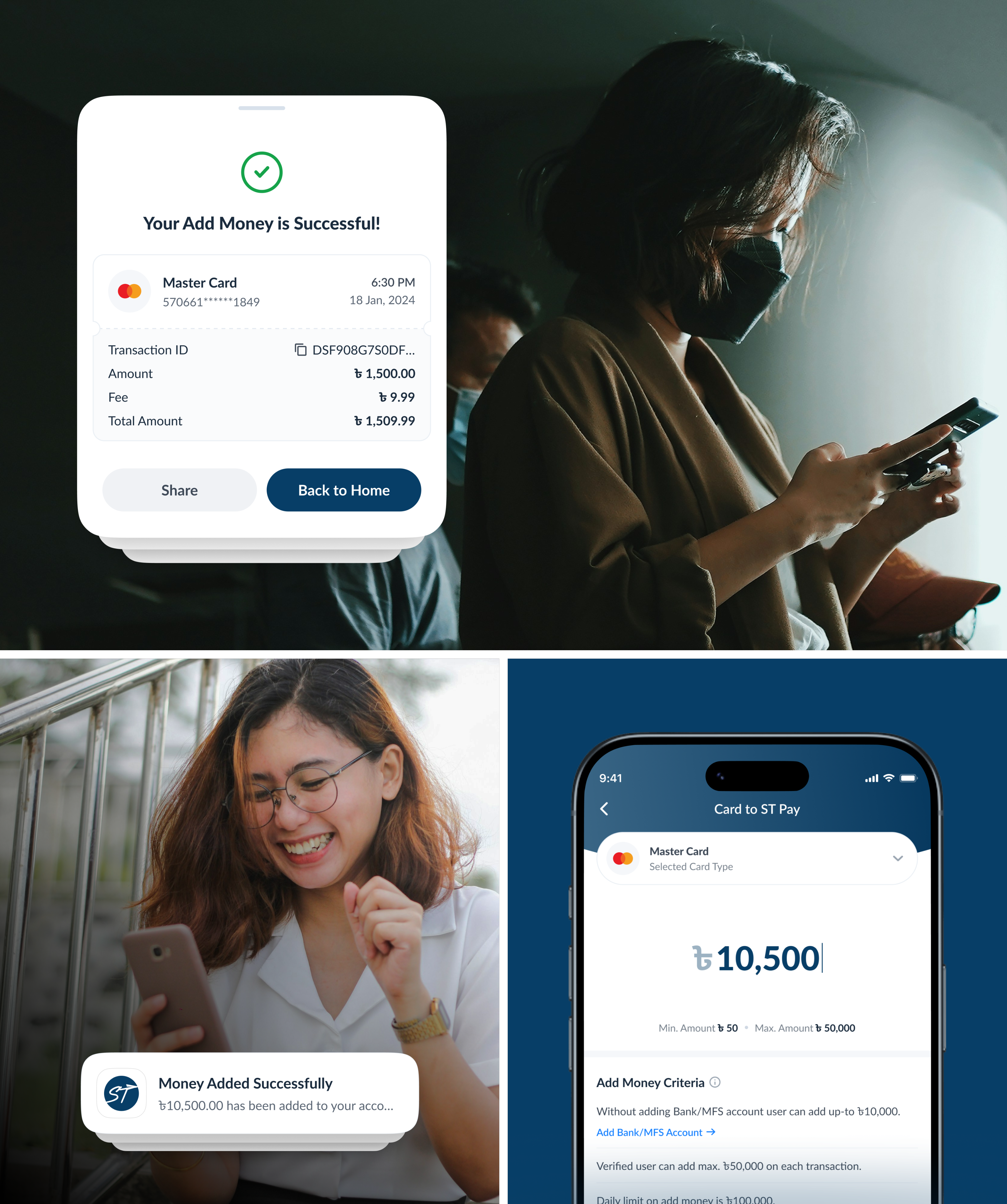
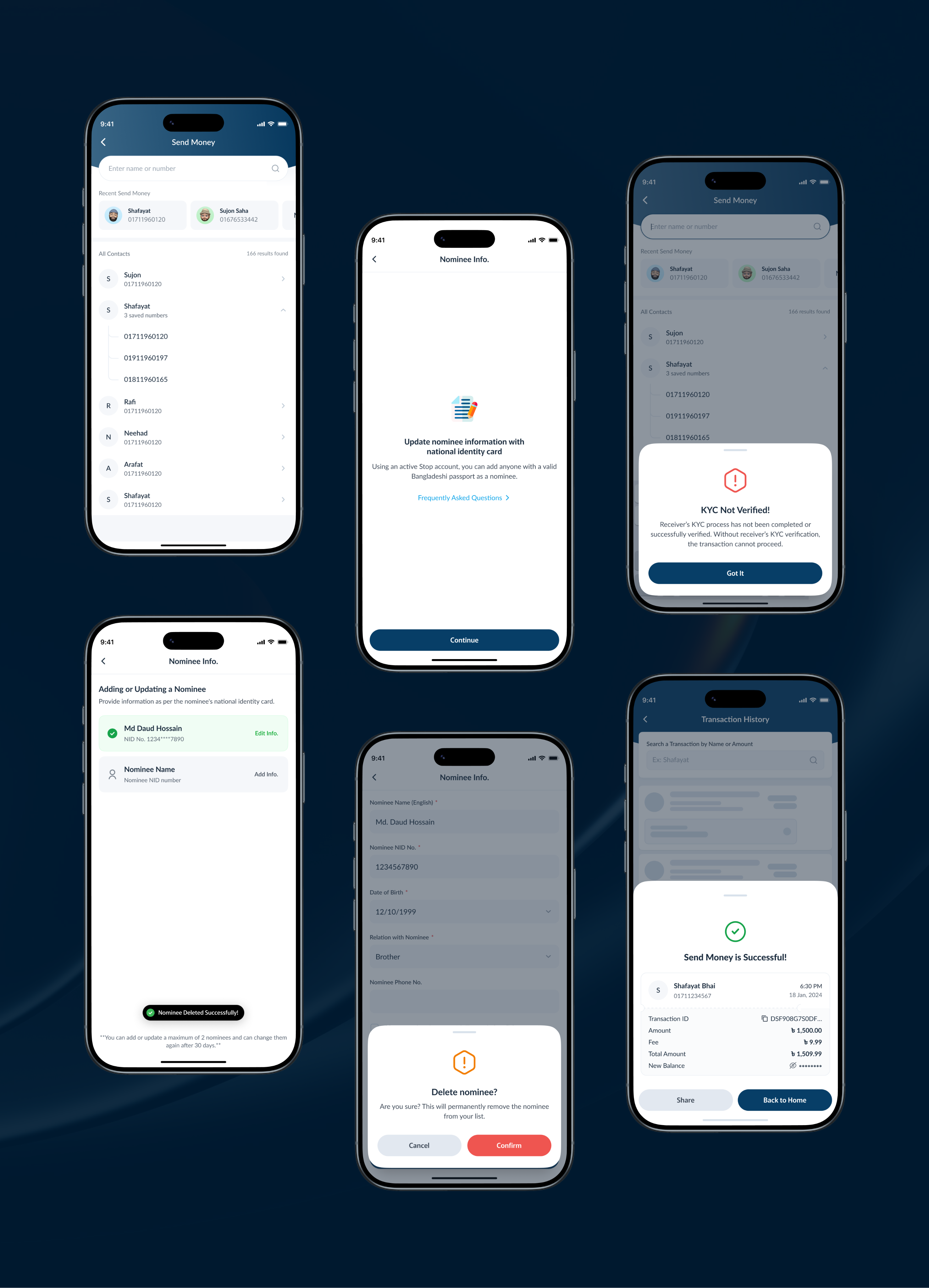
- Stronger validation: Real-time validation for payment details with clear error feedback.
- Reduced clutter: Removed unnecessary actions to streamline navigation and decision-making.
- Improved checkout flow: Redesigned in-app checkout with clear options and upfront fee disclosure.
Process
The UX design process behind the scene
A clear, design-first process focused on real traveler workflows and everyday use.
01 — Discovery & Research
Understanding the travel payment landscape, user needs, and key product gaps. Market research, wallet workflow analysis, identifying user drop-offs, and key user pain points.
02 — Structure & Wireframing
Mapping the core jobs of the wallet — top up, pay, and track — into clear information architecture and low-fidelity wireframes.
03 — UX & Visual Design
Crafting a clean, trustworthy visual language with reusable components, consistent patterns, and accessible states.
04 — Testing & Handoff
Validating with moderated usability sessions, refining edge cases, and delivering specs and prototypes to engineering.
Research
User Research & Insights
To understand how users perform everyday wallet and payment tasks, identify usability issues, and uncover opportunities to simplify the experience.
- Users struggled with clarity: Payment options and labels were confusing, especially for first-time users.
- High cognitive load: Too many actions and unclear hierarchy made tasks feel complex.
- Frequent input errors: Lack of validation led to incorrect payment details.
- Unclear next steps: Users often hesitated because they didn't know what to do next.
- Trust issues: Poor feedback and unclear messaging reduced confidence during transactions.
Visual Design
Visual identity and brand story
The product is designed to simplify everyday travel payments for users who are not finance experts. The goal is to create a sense of clarity, trust, and control — helping users confidently manage transactions without confusion or errors.
The brand positions itself as a reliable travel companion, removing complexity from payments and making digital transactions feel approachable and secure.
Results & Outcomes
Outcomes that moved the needle
The redesigned wallet delivered measurable improvements across activation, completion, and trust.
- Simplified interface: Cleaner layout with improved spacing and visual hierarchy for better focus.
- Clearer guidance: Separated payment options and added helpful tooltips for better understanding.
- Stronger validation: Real-time validation for payment details with clear error feedback.
- Reduced clutter: Removed unnecessary actions to streamline navigation and decision-making.
- Improved checkout flow: Redesigned in-app checkout with clear options and upfront fee disclosure.