e-commerce
Shop Design - Smoother Buying Journey
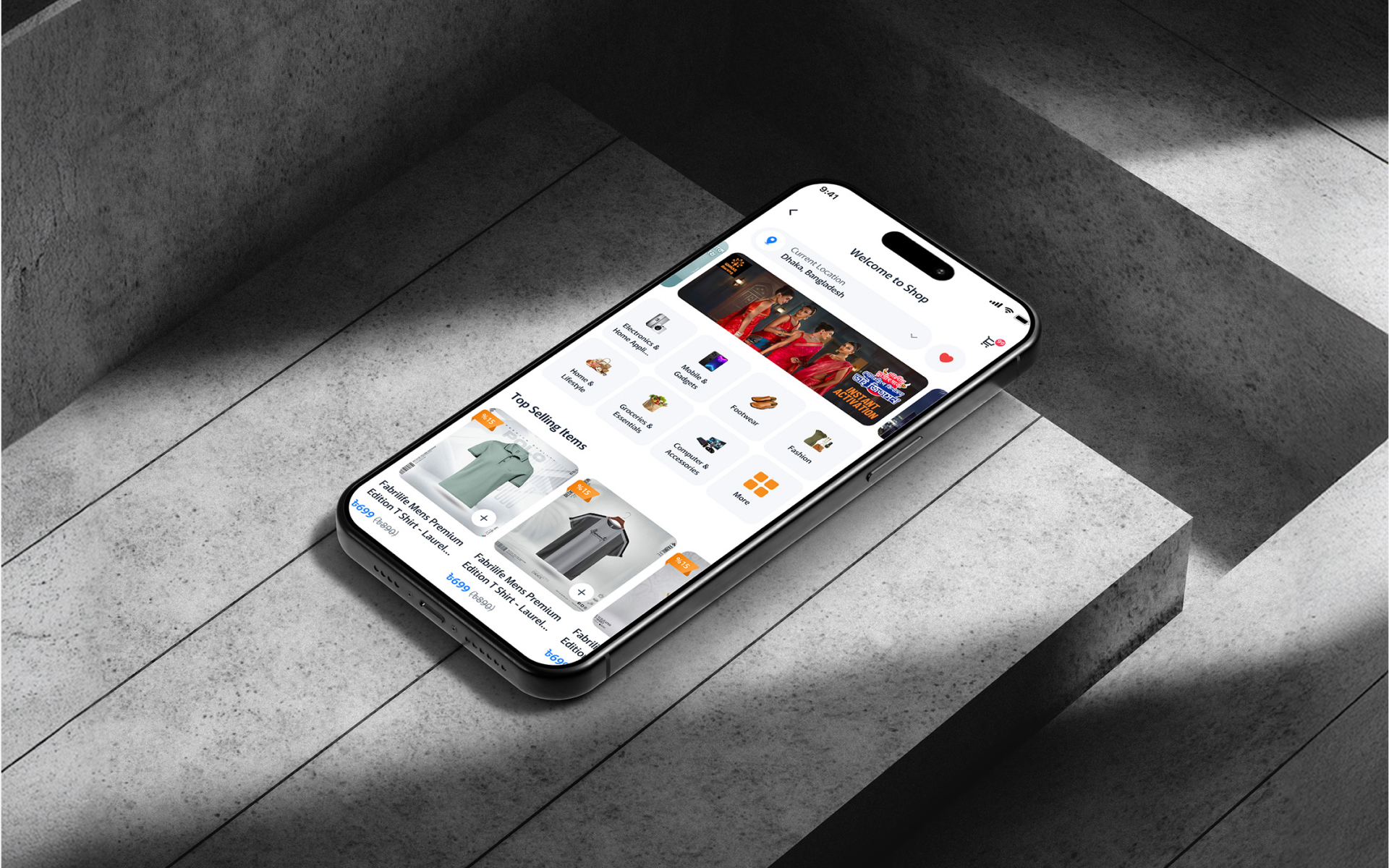
Project Overview
An e-commerce storefront redesign focused on optimized product discovery and a frictionless checkout flow — improving conversions and creating a smooth, trustworthy shopping experience across web and mobile.
Industry
E-commerce
Location
Bangladesh
Platform
Web & Mobile
Problem Identification
Where shoppers got stuck
Analytics showed healthy traffic but weak conversion. Users were willing to buy — the interface kept getting in the way.
- Buried product discovery: Shoppers couldn't find relevant products quickly, so they browsed less and left sooner.
- Cluttered product pages: Dense layouts hid key details like price, variants, and delivery information.
- Long checkout: Too many steps and forms caused cart abandonment right at the finish line.
- Weak trust signals: Missing reviews, return policy clarity, and payment reassurance hurt conversion.
Solutions
Design Improvements
We rebuilt the shopping journey around clarity and momentum — helping shoppers find, trust, and buy with fewer interruptions.
- Streamlined discovery: Clear categories, smarter search placement, and curated collections surface products faster.
- Focused product pages: A scannable hierarchy puts price, variants, and delivery info where the eye lands first.
- One-page checkout: Condensed checkout with guest mode, saved addresses, and clear progress indication.
- Trust by design: Reviews, guarantees, and secure-payment cues placed at decision moments.
Process
The UX design process behind the scene
A conversion-focused process grounded in funnel data and real shopper behavior.
01 — Discovery & Research
Funnel analysis and user interviews to find where shoppers hesitated, dropped off, or lost trust.
02 — Structure & Wireframing
Rebuilt the shopping journey — browse, compare, buy — around the shortest path to purchase.
03 — UX & Visual Design
A clean storefront language with consistent components, generous spacing, and clear CTAs.
04 — Testing & Handoff
Usability tests on the new checkout, quick iterations on copy and hierarchy, then full handoff specs.
Research
User Research & Insights
Interviews and session recordings revealed how people actually shop — and where the old design fought them.
- Scanning over reading: Users skimmed product pages; anything not visually prominent was effectively invisible.
- Checkout anxiety: Unexpected costs and long forms were the top reasons for abandonment.
- Mobile-first shoppers: Most traffic was mobile, but layouts were designed desktop-first and felt cramped on phones.
- Decision paralysis: Too many similar options without comparison support delayed purchases.
Results & Outcomes
Outcomes that moved the needle
A faster path from landing to purchase, with clearer product information and a checkout shoppers actually complete.
- Streamlined discovery: Clear categories, smarter search placement, and curated collections surface products faster.
- Focused product pages: A scannable hierarchy puts price, variants, and delivery info where the eye lands first.
- One-page checkout: Condensed checkout with guest mode, saved addresses, and clear progress indication.
- Trust by design: Reviews, guarantees, and secure-payment cues placed at decision moments.