mobility_service
Car Rental Experience
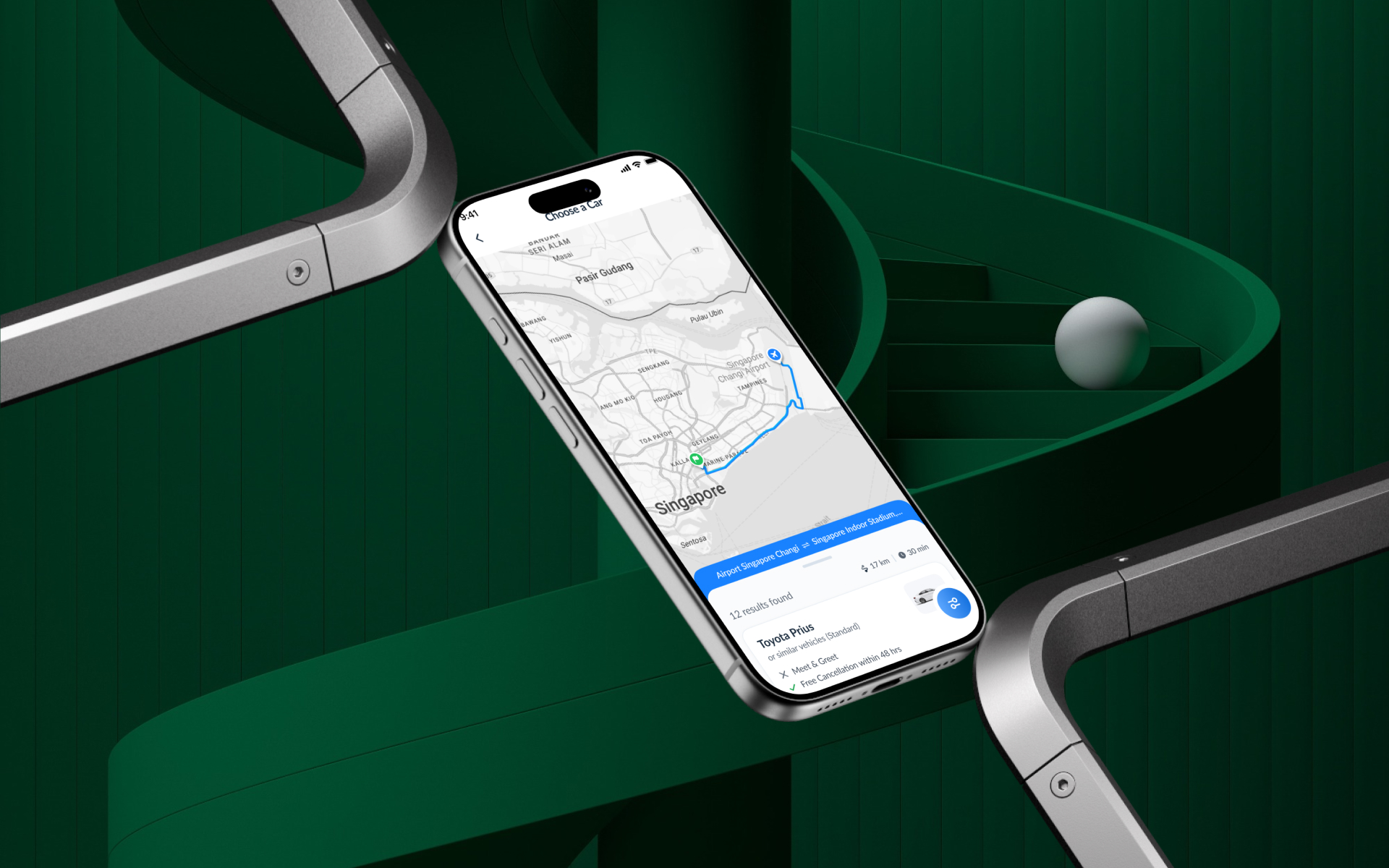
Project Overview
A smooth car booking journey with clear pricing and easy child seat selection — designed so families can book the right car with confidence and no surprises.
Industry
Mobility
Location
Bangladesh
Platform
Mobile App
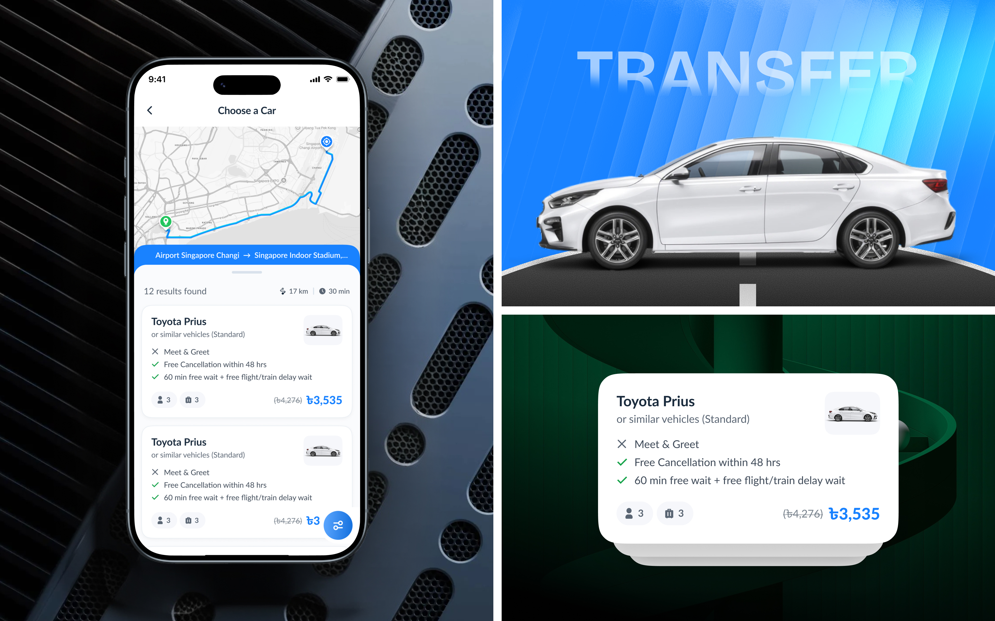
Problem Identification
Where renters lost confidence
Renters could find cars but hesitated to book — unclear totals and late surprises made every step feel risky.
- Confusing pricing: Daily rates, extras, and deposits were scattered across screens, making totals unpredictable.
- Hidden requirements: Documents and eligibility rules surfaced late, blocking users mid-booking.
- Difficult car comparison: Similar cars were hard to tell apart without clear specs, photos, and features.
- Painful extras selection: Adding a child seat or GPS meant digging through dense forms with no clear pricing impact.
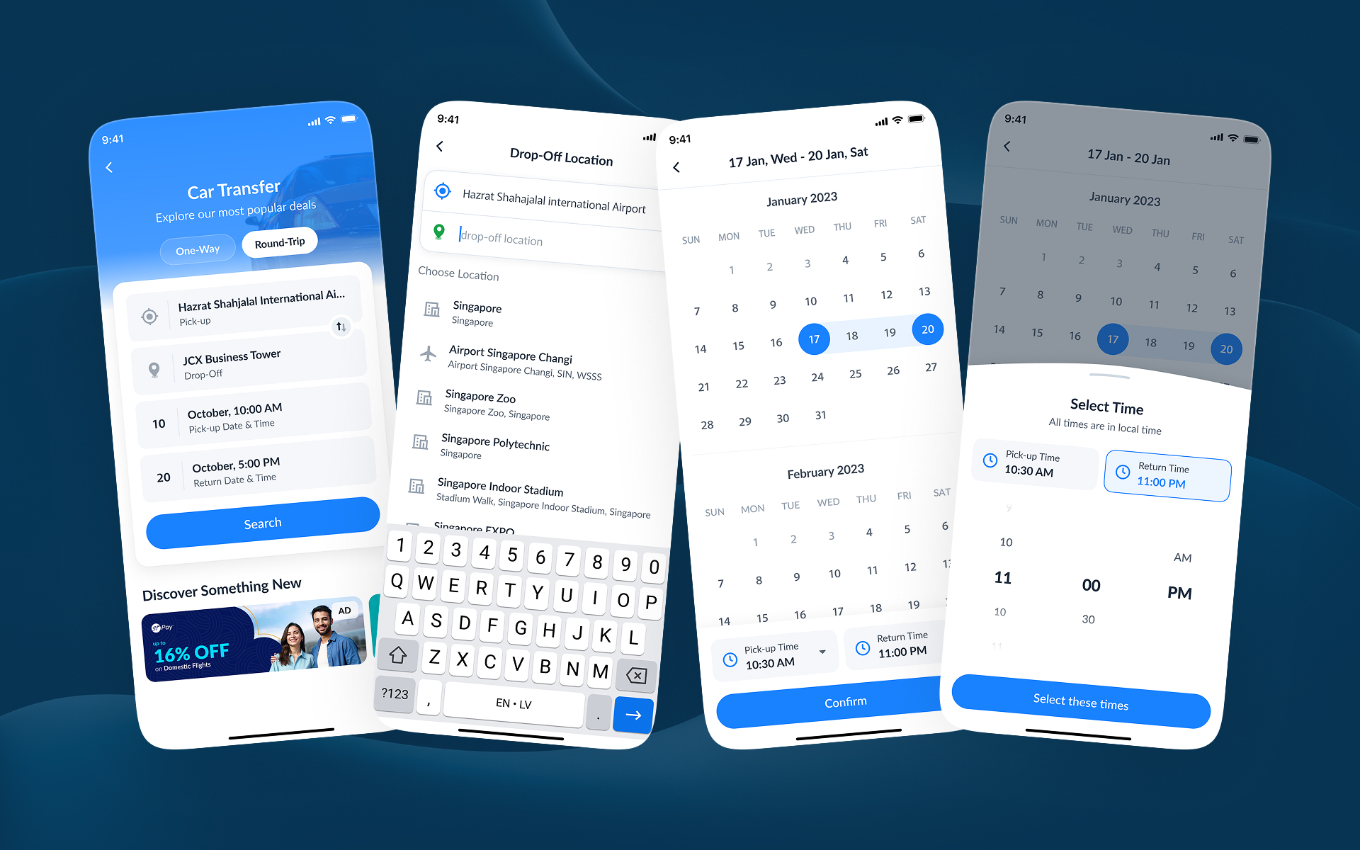
Solutions
Design Improvements
We redesigned booking around transparency — a clear price from the start and extras that are easy to add and understand.
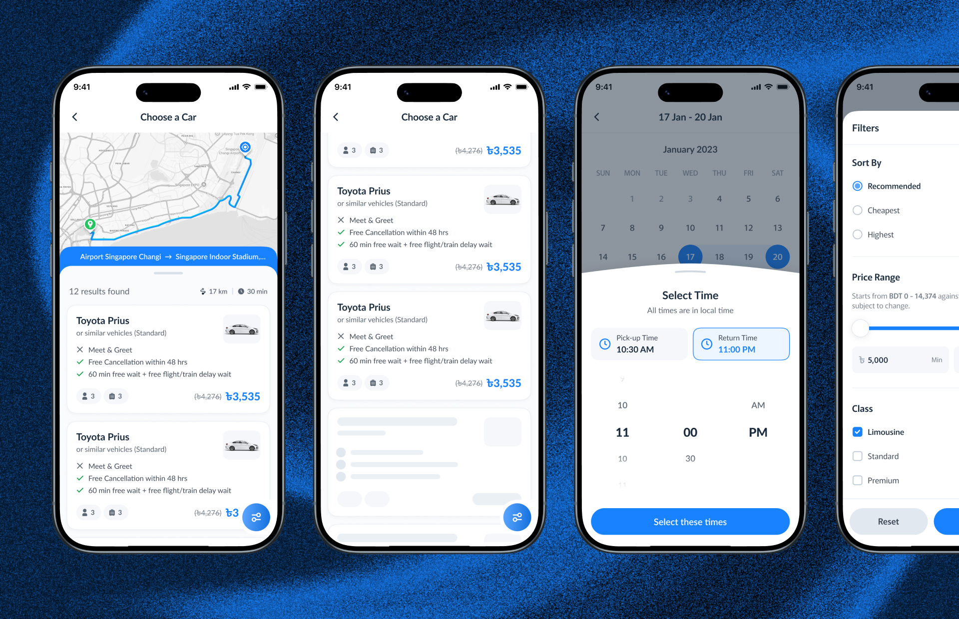
- Upfront total pricing: One clear price card showing rate, extras, and fees updating live as options change.
- Early requirements check: License and document needs shown at the start, not discovered at checkout.
- Comparable car cards: Standardized specs, photos, and feature chips so families can compare at a glance.
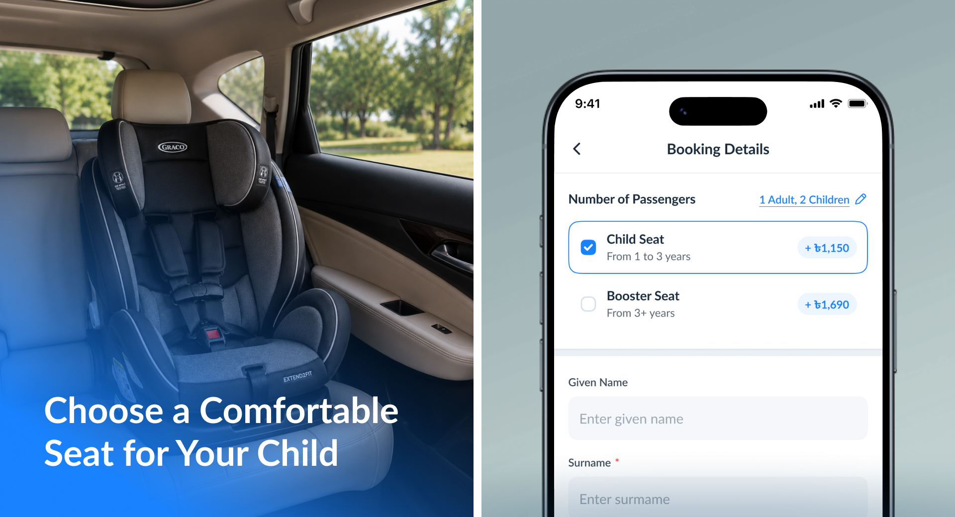
- Simple extras flow: Child seats, GPS, and insurance as one-tap add-ons with instant price feedback.
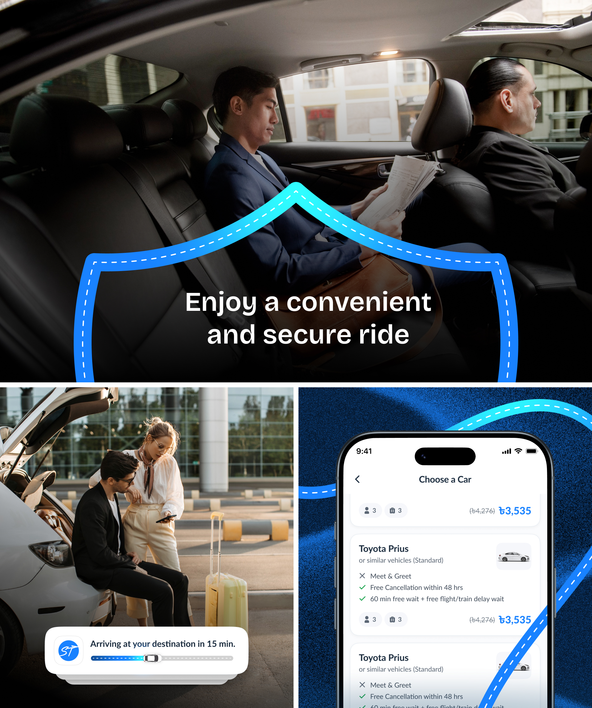
Process
The UX design process behind the scene
A research-led process centered on the family renter's decision journey.
01 — Discovery & Research
Journey mapping with families and business renters to find where trust and clarity broke down.
02 — Structure & Wireframing
Rebuilding the flow around a transparent price-first mental model.
03 — UX & Visual Design
Spec-driven car cards, live price summaries, and friendly add-on selection patterns.
04 — Testing & Handoff
Usability tests focused on family scenarios like child seats, then polished handoff specs.
Research
User Research & Insights
Conversations with families and frequent renters shaped every design decision.
- Families plan around constraints: Child seats and space needs came first — the app needed to respect that order.
- Price surprise kills trust: Any fee revealed late was perceived as hidden, even when legitimate.
- Comparison fatigue: Users gave up when comparing cars required opening multiple screens.
- Reassurance matters: Clear insurance and support information strongly influenced which car users chose.
Results & Outcomes
Outcomes that moved the needle
Confident bookings, fewer support questions about pricing, and an extras flow families actually use.
- Upfront total pricing: One clear price card showing rate, extras, and fees updating live as options change.
- Early requirements check: License and document needs shown at the start, not discovered at checkout.
- Comparable car cards: Standardized specs, photos, and feature chips so families can compare at a glance.
- Simple extras flow: Child seats, GPS, and insurance as one-tap add-ons with instant price feedback.